Here's a bit of Kansas City area political rebranding . . .
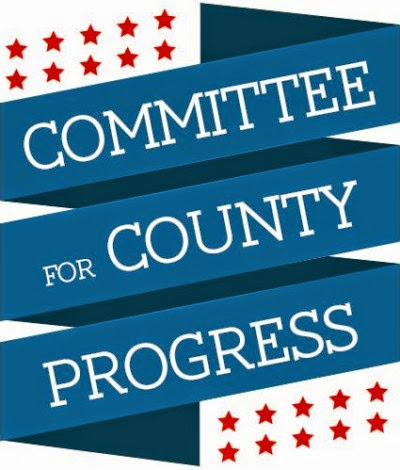
CELEBRATE THE NEW LOGO FROM THE COMMITTEE FOR COUNTY PROGRESS!!!
Nice lines, much brighter and more celebratory than the last insignia . . .
Credit to CALEB who designed this one right before he left to NYC.
And this is probably a good spot to remind folks that the TKC BLOG COMMUNITY featured the recent CCP election endorsements before anybody else in town . . .
More in a bit . . .
If Caleb can redo the logo of an obscure political club in KC, he'll just kill in the Big Apple.
ReplyDeleteAnd in NYC, he really doesn't need a car.
Of course, he probably needs a job.
And he'll find out what folks on the coast really think about KCMO.
Nyet, nyet, nyet!
ReplyDeleteThat's nice, but it needs to appear much more like the CCCP and Red Star before the Politburo approves.
We've passed the word to Brooklyns Diehipster.com another Caleb has arrived in town so he may make the Todays Hipster Beating column.
ReplyDeleteDo they screen candidates based on their views of unsolicited bulk email?
ReplyDeleteOr their ability to eat pussy like a thirst stricken dog ?
ReplyDeleteMore typical shitty design work from CK!
ReplyDeleteI would think a thirst stricken dog would want water rather than Caleb?
ReplyDeleteBFD
ReplyDelete